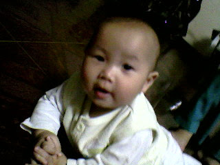
Picture of a baby

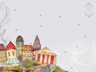
Background picture: I already had this one for a long time, so I do not know where its source is

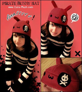
This picture I took from Deviantart
As you can see, the baby image has a bad quality which is dark, noise, awful... Therefore, I firstly work with this image.
I began with reducing the noise for the baby image by using Gaussian Blur after choosing face area by Quick Selection Tool. Then, I copied the baby to the background image by Move Tool
In response to the background image, the first thing I did is to resize that image into 800x 600 px and then erasered the Ali's dream logo by using Clone Stamp Tool
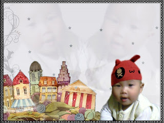
After placing the baby in the bottom right of the background image, I played with Color Balance, Hue/Saturation Curve and Level to achieve a perfect skin for the baby. However, because the original image is too dark, it so left a black area on the baby's head. I solved this by wearing a hat for that baby (the hat taken from the third image)
Finally, I duplicated the baby two times, placed them in those position, chose Blending Screen Mode and reduced opacity to 50%.
Actually, I am not happy with this result. As you can see, in the space between 2 babies, there is a stuff created by 2 arms of babies. Anyone knows how to solve this problem, I do not like using Brush, SO PLEASE DO NOT TELL ME TO USE BRUSH!!!!
PS: I lkie to use Gradient Tool to fix that problem, but sometime, it does not work as I wish, anyone knows how to perfect Gradient Tool, help help plz
Anyways, Enjoys this baby again, my friends.


1 comment:
Well done.. it's cute ^^
But i think there is problem with the baby's face. it's not clear.
It looks like the picture is scaled alot so pixel is blur.
Post a Comment