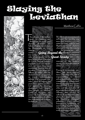
Black and white are my favorite colors. Therefore, i designed this layout in these two colors only. However, it still look very cool, right? Remember what our teacher said, "just keep it simple"!!!
I think this picture has something like Japanese style 'cause i divided the original picture into three parts and those three long pics are quite similar to the Japanese traditional pictures.
The body text in my work is not dull, plz click on the image and see ^^


2 comments:
...Cool layout... but you should not put the Sub-Title between the document...
...That is a good idea when you decreased the opacity of image... but a little bit difficult to read...
Yeah, I agree with Thang's idea, the text is quite difficult to read if you put the image behind! Overall the layout look good!
Post a Comment