Friday, 12 September 2008
tutorial
posters for our group's marketing plan
Tuesday, 26 August 2008
Olympics 2008 Monkey Movie
When i went to "bbc.com" to read some news, i saw that the BBC Sport's did make marketing campaign and titles for Olympic Games 2008 based upon the traditional Chinese folklore 'Journey to the West'. Then I went to "youtube" and download this video. Although Olympic 2008 was over, I'd like you guys to take a look at this video above and see how creative the producers are! (Jamie Hewlett and Damon Albarnm)
pagoda pics
My favourite ads of BMW
Saturday, 23 August 2008
My pics
Thursday, 21 August 2008
My portfolio
Sunday, 17 August 2008
Photograph
Wednesday, 13 August 2008
My portforlio's layout

This is the layout of my portfolio assignment this semester. I had tried some animation characters such as Doreamon as well as a draft of ghost. Then, i wanted to keep my portfolio simply, so i used my own picture which were taken in last semester. Many people think that the colors of this layout are boring. Personally, i consider that black and white are "everlasting". Admittedly, they are the symbol of elegance and simplicity.
Friday, 8 August 2008
Strange Pictures
SuShi Art
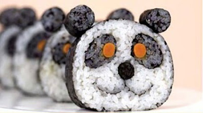
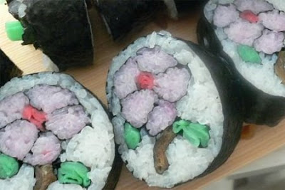
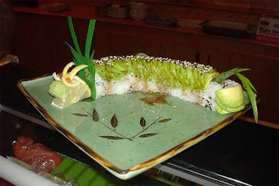
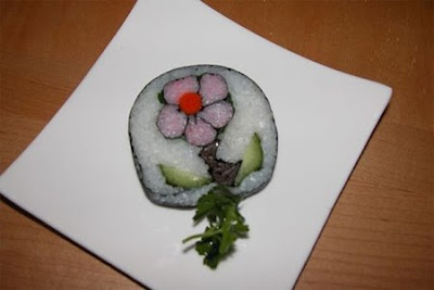
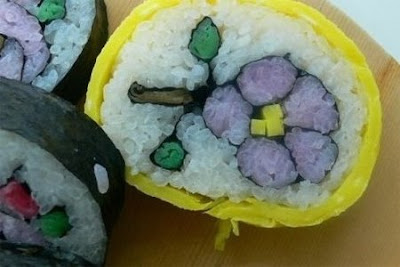
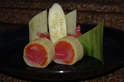
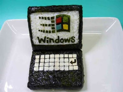
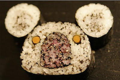
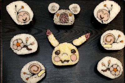
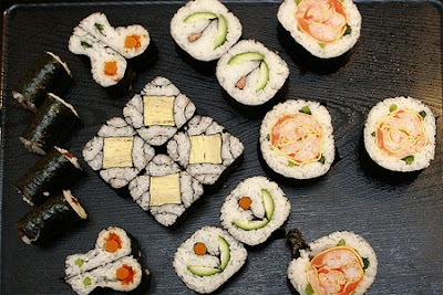
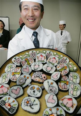
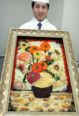
(Credit to: "Daily Yeh")
Friday, 1 August 2008
Poster

This is my poster for our assignment. It's combined by three different photos. At the first time, my idea is about a young tiger looking at a women who wear a tiger coat and thinking "Is she my mother?", but I can find any young tiger that have a surprised face as I wish. So that, I changed my idea to another tiger which is so angry when seeing a girl wearing a tiger coat. And this is my work.
Tuesday, 29 July 2008
Flash Animation
Friday, 25 July 2008
layout
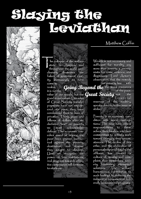
Black and white are my favorite colors. Therefore, i designed this layout in these two colors only. However, it still look very cool, right? Remember what our teacher said, "just keep it simple"!!!
I think this picture has something like Japanese style 'cause i divided the original picture into three parts and those three long pics are quite similar to the Japanese traditional pictures.
The body text in my work is not dull, plz click on the image and see ^^
Microsoft surface
- direct interaction
- multi-touch contact
- a multi-user experience
- and object recognition
Thursday, 17 July 2008
Picture Collage Maker
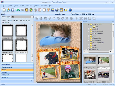 Some functions of this program:
- Create Collage - Allows you to create a mixed–image collage page by compiling various pictures of any size; then you can overlay, arrange, adjust and configure the images to match your taste.
- Photo Collage Wizard - Offers a way to create a photo collage automatically, with selected photos and a single click of a button.
- Frames and Boarders - Included. A large number of borders and frames are available in the collage program.
- Clip Art - Included. A large number of cliparts are available in the collage program.
- Photo Masks - Included. A large number of masks are available in the collage program.
- And more...
Source: Megasharesvn.com
Making Frame
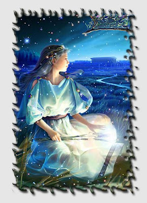
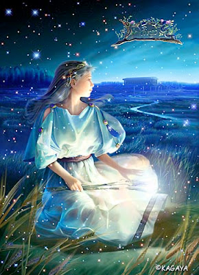
It is easy, just need to follow those steps:
Step 1: Duplicate layer (ctrl+ J)
Step 2: Use Rectangular Marquee Tool (M) to draw a square that coves picture we want to put in frame.
Step 3: Select -> Inverse (Shift + Ctrl + I) to the other side
Step 4 Edit in quick Mask Mode (Q)
Step 5: Filter -> Distort -> Ripper
Step 6: Edit in quick Mask Mode (Q)
Step 7: Press Delete to delete that selection
Step 8: Select -> Inverse (Shift + Ctrl + I) to the picture we want to put in frame
Step 9: Duplicate layer (ctrl+ J)
Step 10: Play with blending option to achieve a happy frame.
Step 11: Ctrl + Drag that layer to the other background where you want to put this picture with frame.
Thursday, 10 July 2008
Making rain
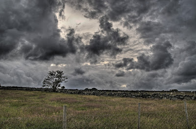
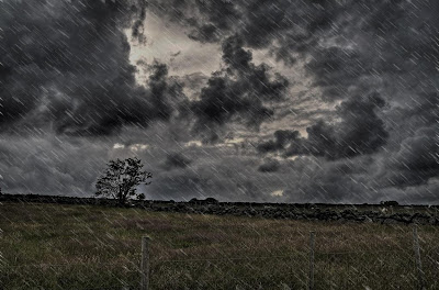
I will show you how to create it right now
Step 1: duplicate layer (Ctrl +J)
Step 2: Adjustment lightness for picture in or other to create a dark sky which is going to rain by using Level
Step 3: create a new layer
Step 4: Fill background with 50% gray
Step 5: Filter -> Noise -> Add noise
Choose Monochromatic and Gaussian
Maximum amount (400%)
Step 6: Filter -> Blur -> Gaussian Blur
Radius: 0.5 pixels
Step 7: Modify level
Channel RGB
Input level: 230 / 1.13 / 255
Output level: 0 / 255
Step 8: Filter -> Blur -> Motion Blur
Choose appropriate angel of the rain for your picture
Distance about 20 pixels
Step 9: Modify level to make the rain clearer
Step 10: Blending 2 layers with Screen Mode
Have Fun!!!
Turning digital image into drawing picture

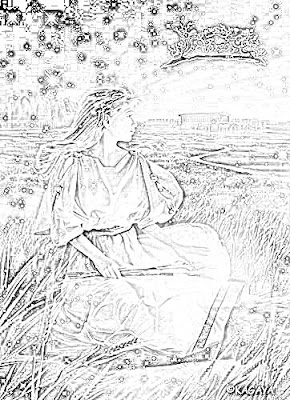
Follow those steps if you want a picture like that
- Step 1: Duplicate layer (Ctrl+J)
- Step 2: Change image into grayscale image by pressing Ctr +Shift + U or Image -> Adjustment -> Desaturate
- Step 3: Duplicate layer (Ctrl+J)
- Step 4: Ctrl + I or Image -> Adjustment -> Invert
- Step 5: Change layer 1 to Color Dodge mode or Linear Dodge mode, this will change your image into white color
- Step 6: Filter -> Blur -> Gaussian Blur -> chose the appropriate Radius pixel for your image
- Step 7: Convert all layers into one by pressing Ctrl + Shift + E, then duplicate layer again (Ctrl+J)
- Step 8: In order to make your picture clearer, blending layers to Multiply mode and find the approximate opacity for your image.
Have Fun, guys
Friday, 4 July 2008
Making Fog
Here I will show you how to create fog just by one simple tool of Photoshop: Gradient Tool
Take a look at the original photo, it is easy to see that there are 2 men sitting not in the right places. Therefore, I use Crop Tool to perfect that picture with the 800x600px
In the next step, I choose Gradient tool like this one:

Drag mouse from the top to the middle of the photo, you will see the result
Enjoys
Thursday, 3 July 2008
Playing with Photoshop
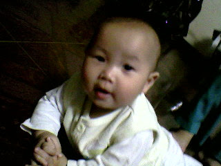
Picture of a baby
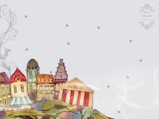
Background picture: I already had this one for a long time, so I do not know where its source is
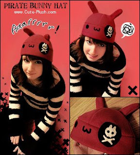
This picture I took from Deviantart
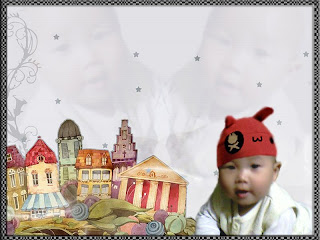
I began with reducing the noise for the baby image by using Gaussian Blur after choosing face area by Quick Selection Tool. Then, I copied the baby to the background image by Move Tool
In response to the background image, the first thing I did is to resize that image into 800x 600 px and then erasered the Ali's dream logo by using Clone Stamp Tool
After placing the baby in the bottom right of the background image, I played with Color Balance, Hue/Saturation Curve and Level to achieve a perfect skin for the baby. However, because the original image is too dark, it so left a black area on the baby's head. I solved this by wearing a hat for that baby (the hat taken from the third image)
Finally, I duplicated the baby two times, placed them in those position, chose Blending Screen Mode and reduced opacity to 50%.
Actually, I am not happy with this result. As you can see, in the space between 2 babies, there is a stuff created by 2 arms of babies. Anyone knows how to solve this problem, I do not like using Brush, SO PLEASE DO NOT TELL ME TO USE BRUSH!!!!
PS: I lkie to use Gradient Tool to fix that problem, but sometime, it does not work as I wish, anyone knows how to perfect Gradient Tool, help help plz
Anyways, Enjoys this baby again, my friends.
